In this penultimate section, I’m focusing on delineating the last elements of the Project Plan for Verner’s Tale. The presentation is more or less in the form of a graphic novel query letter, which I researched in the first few parts of this course.
Elements of project presentation/graphic novel query:
- a summary (like a blurb on the back of the book),
- information about the world, the characters, and the genera,
- visual development:
- designs for main characters,
- important elements
- environments,
- sample pages,
- process summary/author bio,
- a synopsis (not a summary, but a complete overview of the story).
So far, I have everything except environments. So this is what I will be focusing on in addition to refining previous work.
Adjustments
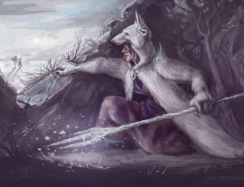
The dwarf and the curse needed a little more work. The goldsmith dwarf illustration was not quite detailed enough and I wasn’t entirely happy with the colors. I keep flip-flopping on color saturation, sometimes it feels too bright and then I look back and can’t help but feel it’s too boring.


I haven’t changed anything about the ibex-lynx thing, I just used it as a model for testing out yet more curse design ideas. Since the curse originates from mirror-shards, I decided to lean more into that and see how it goes. I’m trying to make it look interesting as well as easy to replicate. Mirrors and crystals and things like that are always cool to look at and draw. I also think this approach would make for interesting environments once the curse really takes over the forest at the nexus.

Mood board, Glass and Mirrors

Mood board, Crystals


Environments
I already have a Cederbjerg drawing, but I had not been sure what I wanted the curse to look like yet then, so it’s just kind of… dry. And ochre. I also wanted this environment drawing to tell more of the story, so I included two characters in it. Verner and his sister are having an argument, and we can see the cursed forest in the background. This time, I wanted the affected area to be obvious (and magic-looking) instead of all-encompassing.

Cederbjerg, First Design

One of the earlier thumbnails, in retrospect strongly inspired by the image below (Romance, Maxfield Parrish, 1922, Oil on Canvas)

This one was another contender. It shows more interior, which I liked, but the airiness of the other one really inspired me.

Georg Osterwald, The father’s grave, 1865

Franz Ludwig Catel (German, 1778-1856), “Einsiedler in einer Kirche in einer mondbeschienenen Landschaft/Hermit at a church in a moonlit landscape” (probably 1820-30s)


Many of the character designs’ clothes are strongly inspired by early 19th century fashion, so it follows that some of the architecture might also lean neo-classical. As people of that time were absolutely obsessed with classical Greece and it had the tendency to appear… everywhere. From philosophy to architecture to women’s hairstyles.
Does this particular balcony make much sense in terms of physics? Perhaps not, but I think it looks cool. That railing is definitely not OSHA-approved.


Struggled with the atmosphere a bit. I’ve been thinking a lot about composition lately and I think the biggest problem is that I tend to lose sight of my original goal. So I’ve tried to narrow down the process to two questions: What is the main focal point of the composition? And what is the desired atmosphere? Whenever I want to redo the whole thing in frustration, I try to ask myself what it is in the current piece that isn’t serving those two goals.
In the first few stages, it was the second question that got me over a slump. The whole thing was too bright and harmless-looking. The darkened patch in the distance was inspiring absolutely no dread. So I darkened the whole thing up and brought a little more contrast (and glowy-ness) to the party.

In the latter stages, it was the first question that most served me, because I was getting a little lost in terms of lighting and shapes. The foreground is supposed to be the darkest and the background should theoretically get lighter and lighter because of atmospheric perspective. The problem was that I needed the evil patch to be dark and the characters to have some highlighted elements, and this was harder to negotiate than anticipated. The solution is easy in theory, but in practice keeping to that the middle ground is more difficult, even with the aid of a grayscale filter.
Thoughts on Presentation/Pitch/Query
In order to finalize the pitch, I still need to make some adjustments to the work above and to polish up some of the comic pages. Theoretically, I would also like to design one of the antagonists and update the rest of the character designs, but that is not necessary for now.
There is also something to be said about decorative and design elements, including the title. I haven’t yet tried anything more decorative and it would certainly help give the presentation a more polished look. I would like to try something sort of elongated. Or maybe just something with texture.
The Story

In the presentation, I will be incorporating some of the images I made previously for this project, just to illustrate the story better. They won’t be part of the assessment for this unit, obviously. I have the “portfolio” images for that, as well as the comic pages.


As stated in the introduction, the Project Plan for Verner’s tale must contain quite a few elements. There are several ways to tackle these organizationally, but I think I will do my best to combine them in a way that is both easy to read and is entertaining. I will include the illustrations in the Synopsis. (Which will be much shorter than the one in the previous section.) The character designs, progress sketches, and character descriptions will be part of the Development section. Some description of the origins of the project, as well as my goals for its future also belong here.
What I’ve not decided yet is whether I want to write about the comic pages separately or if it would be better to scatter them throughout.
I outlined most of the story in the last chapter. I won’t be doing so again here, but I’ve been working on the character arcs and worldbuilding, just to fix some of the plot holes and inconsistencies. More of those will appear as I write, but such is writing. I’ve already rendered some of the comic pages irrelevant because of re-writing. That’s what I get for not making a complete outline before starting to draw. Although I always knew these pages would be experimental.
Which is why when I write about the future of Verner’s Tale in the Project Plan, I will be referring to drawing Chapter 1, rather than the chapter I illustrated in this unit. These sample pages are meant to be a test run. I selected a section right in the middle of the story, where all the main characters are in the same place because I wanted to draw them interacting. The story itself will start in Cederbjerg and will only include Verner and secondary characters in the first chapter. I thought it wouldn’t quite deliver the direction of the story properly for a pitch.
But when I tackle the Final Project, I will be illustrating the first chapter, with the goal of eventually finishing the whole book.
I think I will be experimenting a little more with other comic styles whilst I’m in between projects in order to find a faster approach that also looks presentable. It will still be painterly, because that’s how I think and how I draw. But I think I will end up departing from the style I’ve been using for the comic so far.
I challenged myself a couple of chapters ago to draw and post something regularly in order to overcome some of my insecurities. And while I’ve not been entirely consistent, I have discovered something interesting about the way I draw when I need to work fast but also make something presentable enough to be witnessed by the eyes of others. I tend to default to my watercolor and ink origins.

The drawing above is a bit gouache-like, but I still think it looks remarkably like my old watercolor work. Of course, everyone draws differently wit reference, and it’s unlikely that I will be able to find any references for most of the comic panels I will be drawing. Still, it’s something I’m considering when thinking about the viability of the project. There’s a lot of work to be made, and I will need to be able to make a lot of it quickly.
The Characters
The Development section will be mostly characters. Still need a proper villain design (might do Azdar, even if he’s technically a secondary villain because he’s a more active character than the Queen). I have Ida, but she’s a temporary antagonist so I’m not sure she counts anymore. And theoretically all the character designs could use a bit of an update. But I’m going to prioritize finishing the illustrations and comic pages instead of adding more to the workload right now.


I like the look of sketches around a rendered character, but I’m going to experiment with some other presentation styles as well. This looks a bit messy as it is right now.


I’m debating whether or not to include work like this, because these are style experiments. They don’t look anything like the finished product, but then again most of the work I’ve made for this unit has been an experiment in some way or another. I used a different process almost every time, which isn’t something I will be doing when I tackle the Final Project. In some I used lineart, in others I used a painterly approach, some are textured and some are smooth.
They’re all over the place because I’m still figuring out what this project should look like and what I can do when I work quickly. The illustrations weren’t done quickly by any stretch of the imagination, because I wanted to have some more elaborate work in the presentation, and when I was drawing the comic, I was flailing a bit. I think I have a slightly better idea of how to approach it now, but the first time around I definitely wasn’t turning these out at speed.
The Graphic Novel


To say that I have no idea what I want the project to look like is a bit of an exaggeration. The bright colors, the illustrative (rather than cartoony? I’m not sure how to define it. It’s not semi-realistic.) style, and generally whimsical feel are all things that will stay. I won’t suddenly change the aesthetic to something grimdark and grungy or very cartoony and flat.
It would have been ideal to have settled on a style by the end of this unit and for the Project Plan to consist solely of illustrations in that style, but that will have to be something to solve at the beginning of the next stage of this project. Stylistic cohesion and consistency is extremely important in any project, and more so in a graphic novel. Even if one makes allowances for inexperience, there must at least be an attempt at making all the images belong in the same universe, if not always the same planet.
I may not always be able to make perfect likenesses, but I can at least control some things by putting limits on my working process for this project specifically. I never noticed how much I like to play around with the process mid-workflow until I realized that not one of the illustrations above was done in the same way. Limits will also definitely help me to work faster. It seems obvious, and it is obvious, that if one has a very rigid set of steps they are allowed to take to make a thing, they will probably do so faster because the process is not impeded by second guessing.
If nothing else, this project has so far illuminated all the dark corners in my process, and revealed problems I had thought I had solved and refused to look at again. I’ve been experimenting too long, I think and this means that I haven’t really made my brain work with efficiency as a priority. Not in a real sense, despite the fact that was one of the goals I had set at the beginning of this unit. I just didn’t have a good reference point for what that means. I think I will be more strict about the limitations and less fussy about the results and see what happens then. If nothing else, I hope that making a larger volume of work quicker will also help me work better.